Design a screen that looks rightSix steps, from idea to polished UI
Structure before style, colour you can read, and review rounds that catch what you missed. Follow the steps yourself with the prompts below; each one names the skill that does the work.
The steps
The steps
6 steps with a prompt for each
- 1
Brief
Who the screen is for, whether it is a marketing page or a product screen, what it must do, and the one action that matters most.
Skill: Frontend Design
Write a four-line brief for [screen]: audience, marketing or product screen, its job, and the one primary action.
- 2
Structure in grey
What goes on the screen and in what order, before anything gets a colour. Desktop and mobile, with the states people will actually see. Blur it: the primary action should be the strongest thing left.
Lay out [screen] in greyscale, desktop and mobile. One filled button for the primary action. Show the empty or error state too.
- 3
Type and colour
A type scale and a palette derived from your brand colour, as tokens. Every text and background pair checked for contrast before you build, not after.
Skills: Modular Scale Typography or Algorithmic Color Palette
Derive type and colour tokens from [brand colour]. Check every text/background pair against WCAG AA and fix the ones that fail.
- 4
Build
The screen on those tokens, with a look that comes from the subject. A marketing page can take a risk; a product screen stays calm.
Skill: Frontend Design
Build [screen] on these tokens. First plan the look in five lines: colours, type, layout, what makes it specific to [subject].
- 5
Review rounds
Up to three rounds, one change each, with a before and after. Every fix gets checked on every screen size, because fixes break things too.
Skills: (Shift) Nudge or Product Designer
Review this screen. Start with what works, then at most three things that must change, most important first.
- 6
Final check
Fresh eyes on the design, then the code against web interface guidelines: labels, focus, contrast, reduced motion.
Skills: Product Designer or Web Design Guidelines
Final check: review the design as if you see it for the first time, then the code against web interface guidelines. Fix what is clearly wrong.
Rather not copy 6 prompts? The file runs them for you.
Get the workflow fileAn example run
A pricing page for a research toolWhat the steps found
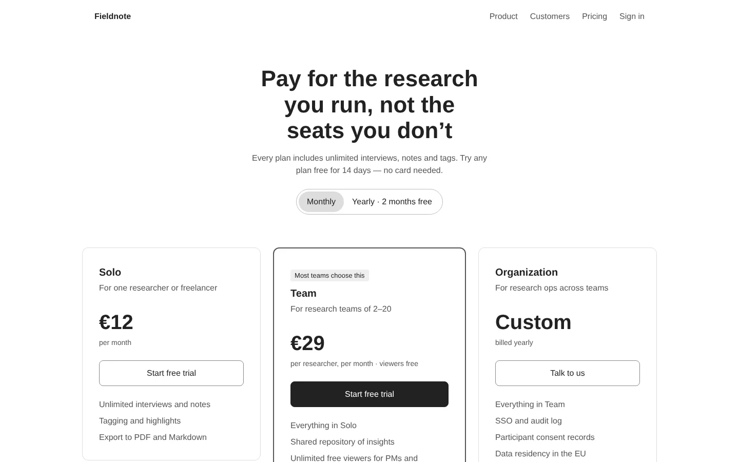
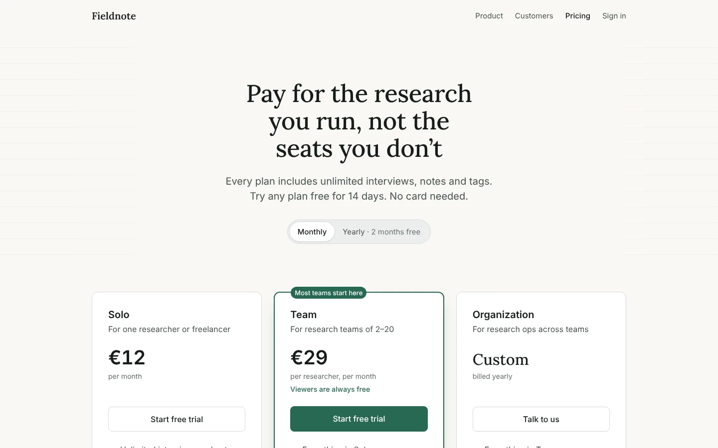
- The headline promised you only pay for researchers. That only showed up in a list; it now sits under the price.
- The selected toggle was a black pill that competed with the main button. It became a quiet white tab.
- On phones the content touched the screen edge. The structure step caught it before anything got a colour.
Get the same steps on your own work.
Get the workflow fileWhat’s inside
The skills behind the stepsOpen source, credited
- The six stepsSkillHub · leads your AI tool through them
- Visual Emphasis and Hierarchydembrandt · MIT
- Modular Scale Typographydembrandt · MIT
- Algorithmic Color Palettedembrandt · MIT
- Frontend DesignAnthropic · Apache-2.0
- Product DesignerAakash Gupta · MIT
- (Shift) NudgeShift Nudge · free by email · optional
- Web Design GuidelinesVercel · linked, not included
Curated by Teun Somers, tested with Claude. Every skill links to its source and keeps its licence.